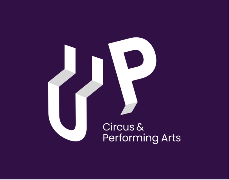
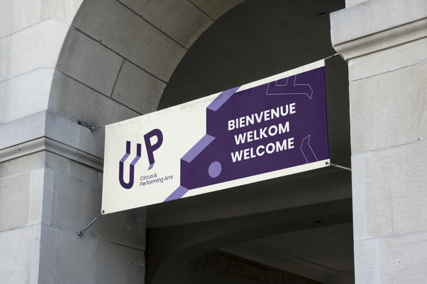
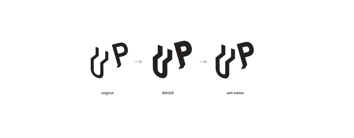
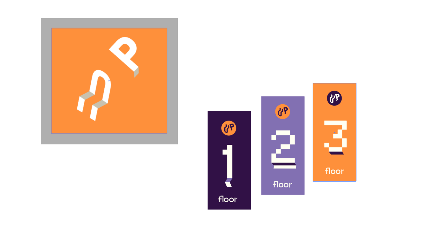
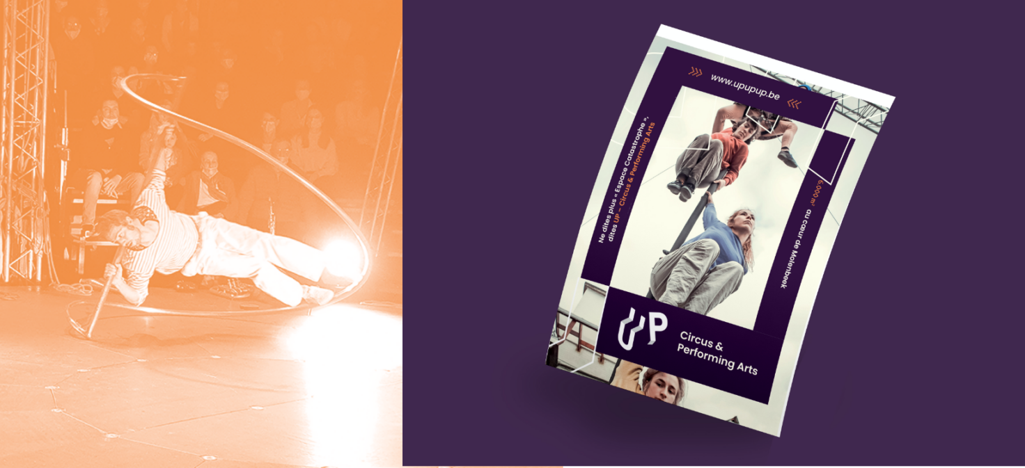
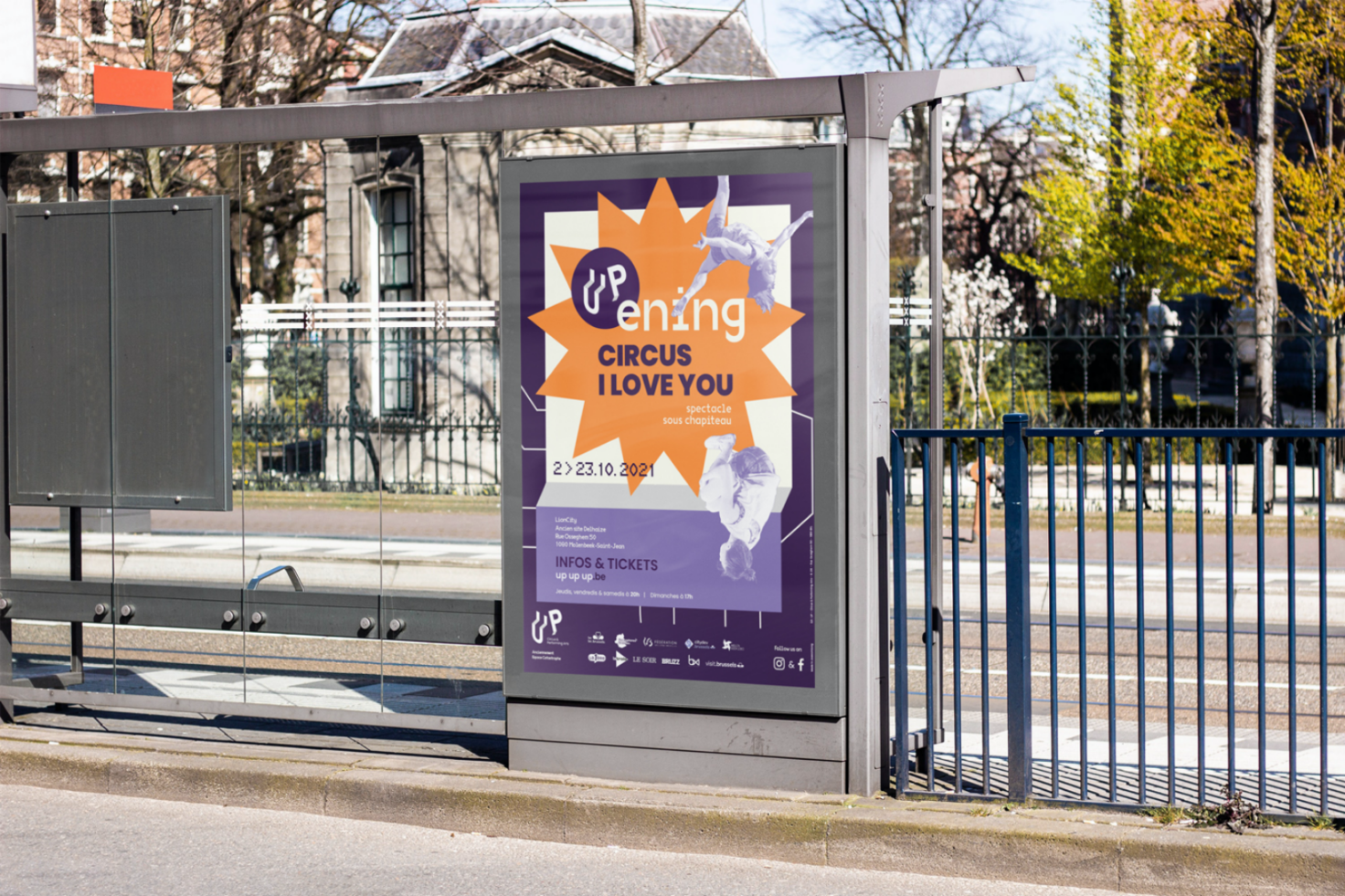
UP UP UP

A rebranding of the world-famous Espace Catastrophe
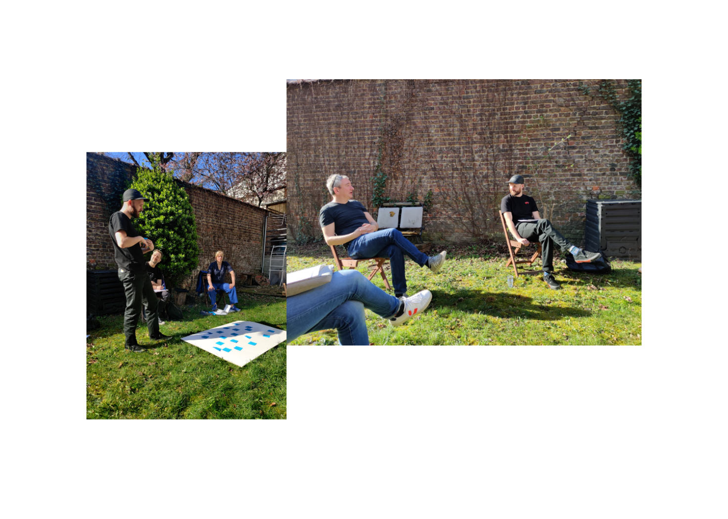
Circus… organisation? Up, formerly Espace Catastrophe, went through a number of changes in recent years: a new location and more specific target groups (spectators, circus lovers/teachers, professionals).

This evolution made it urgent for a new name and image. We were trusted to question the organisation creatively and strategically and to create a clear concept.

“UP – Circus & Performing Arts is the new name of Espace Catastrophe, the International Centre for the Creation of Circus Arts, which is now located at the LionCity site in Sint-Jans-Molenbeek.”

Naming:

As a neutral party, we critically challenged Espace Catastrophe to look at itself from different perspectives and make bold choices where necessary.

We organised a brainstorming session to form the basis of the brand and map out all the touch-points. The aim was to define the Espace Catastrophe identity in terms of content, with clear values and criteria, and then to translate this into one powerful name and brand concept. Espace Catastrophe was reduced to its purest form and its idiosyncratic character.

Concept:

a positive, lively name, coherent brand concept!

Brand image & derivatives

A powerful isometric typography was given a glorious leading role in the new graphic identity. The letters UP became the visual building blocks of the concept. They offer a window on the world of circus, society and the multifaceted life of the circus.

The result?

The initial focus on getting the UP identity clear helped us and them through the rest of the design process.

The result is an identity that is easily understood by the target audience, represents the organisation correctly (in a way they can identify with), and makes it easy for UP to further communicate about themselves and their activities.

< Damien Foundation