Garsons Uniek
Exceptionally served!

One-of-a-kind people!
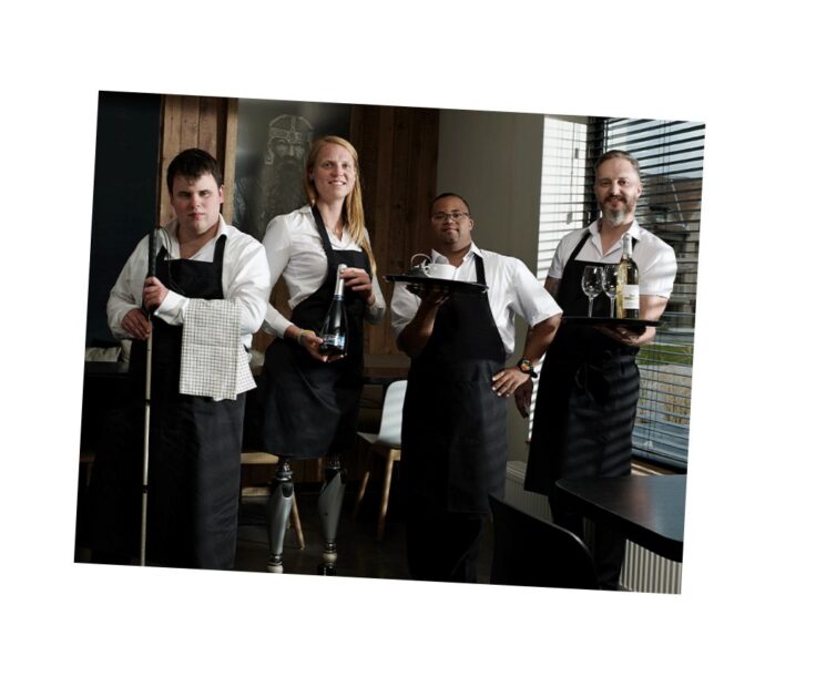
Let yourself be served by the Garsons Uniek! This extraordinary group of friends guarantees enthusiastic and attentive service at events, festivals and receptions. With the Garsons Uniek, visitors immediately experience what participation really means. An experience to cherish!
With this project Ditto vzw aims to create a more accurate image of disability, as there are still too many preconceptions.
What’s in a name?
The original name “Café Squad” had long since ceased to cover the range of this project. Naming became the most important step. Summarising the core message and concept in one or two words was a nice challenge.
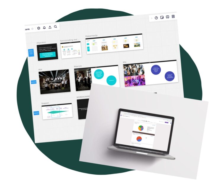
The target group and the criteria were established during an online brainstorming session. Both people with disabilities, event organizers and employees of Dito vzw were involved. In this way, the different target groups were represented and we received accurate feedback.
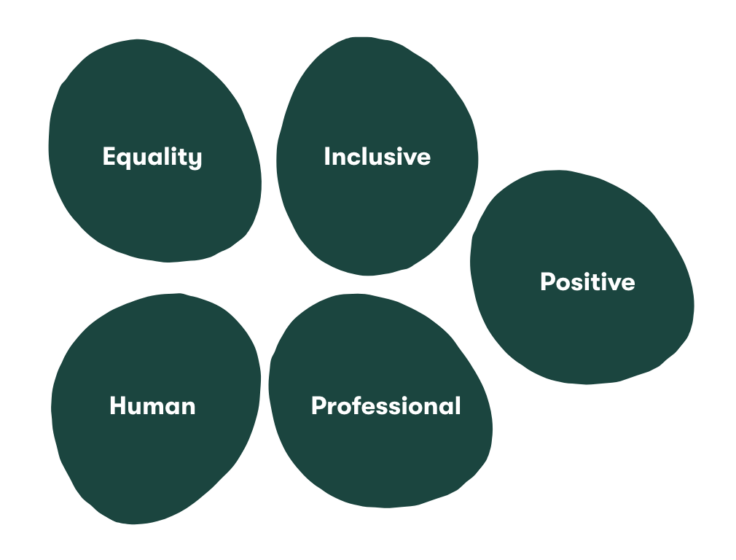
The criteria:
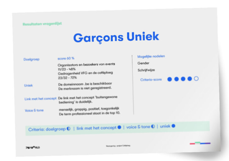
Based on these criteria, we pushed 3 names forward:
“Garsons Uniek”
“Allée Servies”
“De Bon’app Brigade”
A survey of 55 respondents showed that the name Garsons Uniek came closest to the criteria established.
“The word ‘garçon’ has something mischievous
and playful about it, like little boys pulling mischievous pranks, but innocent
at the same time. The word ‘uniek’ refers to a certain individuality,
and the right to just be yourself.
You don’t have to fit into a fixed pattern.“
Survey participant
The thresholds that are cited are gender and language. We decided to simplify the spelling as suggested by a participant and we included the gender aspect for the visual development…
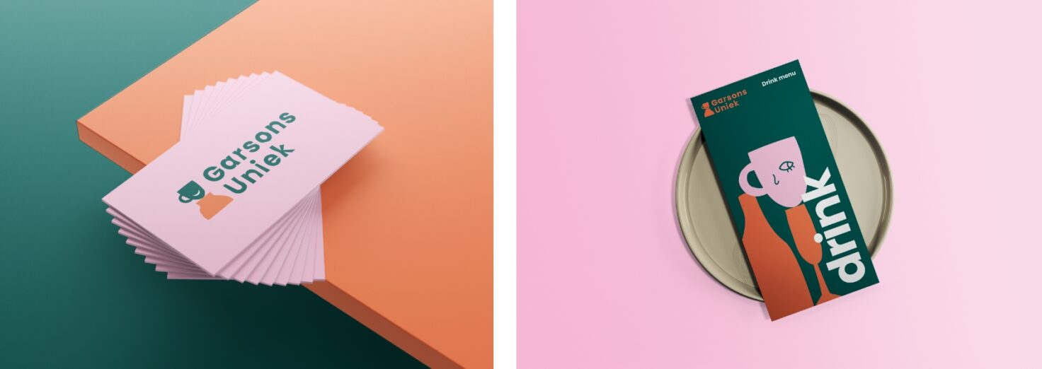
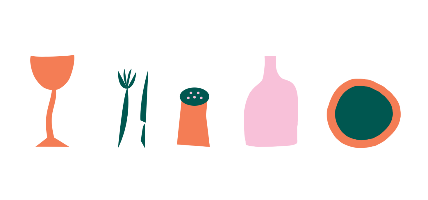
Inclusive brand image & derivatives
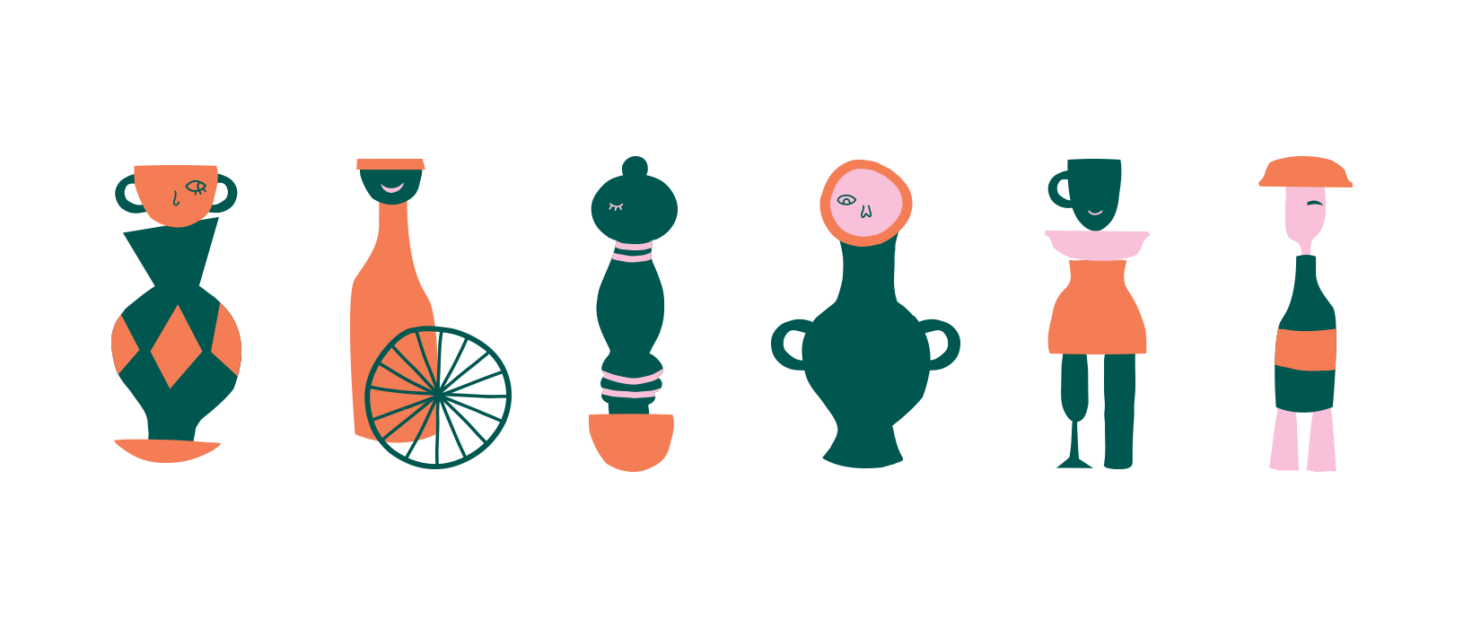
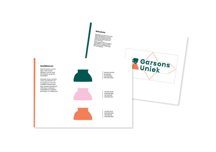
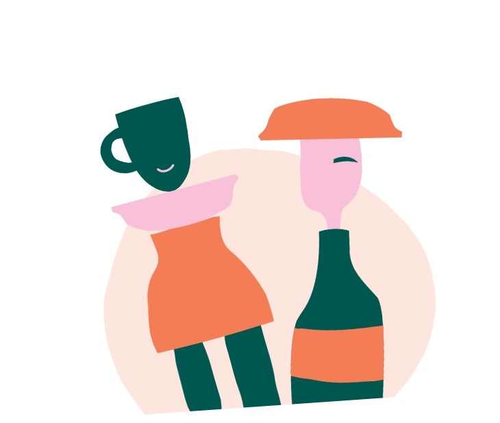
An illustrated, smiling cup will become the eye-catcher of the branding. It alludes to the catering aspect of the project. The ridged typography subtly links to ‘limitation or being unique’. The combination between typography, illustration and the color palette reflect the project content accurately and give it a professional look. Contrasts were taken into consideration when choosing colors so that text is easy to read.
In addition to the brand image, we worked out a series of elements that can be used to assemble various characters. Each character is unique and has a disability. The elements and templates were made available in Canva, so that the team of Dito vzw could work on creating derivatives themselves.