Tea Time: Accessible typography
Geschreven door Agnieszka Piotrowska op 13 March 2023
Hey, we have a challenge for you! Take a look around you and try to spot as many words as possible. A book cover, printed document, your social media feed… Yes, the tag inside your shirt counts as well!
As we are frequently exposed to written texts, there may be times when you are the one creating them. For example, you may want to create a presentation file or design a post in Canva. But how can you make sure that the message gets delivered and that nobody gets excluded on the way?
Let’s start with some very bad examples…


Ok, these are obvious.
But what about the cases when we think something is readable, but not everyone would agree?
Keep on reading!
How can typography be inclusive?
What is readable for us might not always be accessible for other people. For example:
- Ann is 85 years old. The information hanging on the door is too small for her to read.
- Luc has dyslexia. He finds it difficult to read longer texts in italics.
- Alex is nearsighted. They have a hard time reading smaller texts in the presentation.
…the list can keep on going. How to tackle it best?
Step 1: Define your target audience
What is the demography of your target audience? What are their needs? Which obstacles might they encounter?
How are they interacting with the text? (i.e. small screen, computer screen, print, …) All these factors influence the reading experience and can hinder the delivery of your message to your target user.
“Exclusion happens when we solve problems
using our own biases”
– Microsoft Inclusive Design
Step 2: Adapt your typography designs to users’ needs
BODY TEXT
Do’s:
✅ Use clear and legible fonts that are easy to read. Good examples are: Roboto, Open Sans, Times New Roman.
✅ Choose font sizes that are large enough to be readable on any device. (Scroll down for the cheat sheet!)
✅ Use font-weight variations (bold, semi-bold, etc.) for emphasis.
✅ Use proper line spacing to improve readability.
✅ Choose colours with enough contrast to ensure that text is visible to users with colour blindness.
✅ Consider using alternative text (alt text) for images and graphics to provide accessibility for visually impaired users.
Don’ts:
❌ Don’t use too many different font styles, as this can make the page appear cluttered and difficult to read.
❌ Avoid using tiny font sizes, as they can be difficult to read, especially on small screens.
❌ Avoid texts written entirely in italics or CAPITAL LETTERS.
❌ Don’t use light-coloured text on a light background, as this reduces contrast and makes text difficult to read.
❌ Don’t rely on colour alone to convey information, as colour blindness affects many users.
❌ Avoid using low-contrast text, as it can be difficult to read, especially for users with poor eyesight.
TITLES
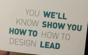
When it comes to titles, you’ve got way more freedom compared to body text. Think of them as the headline of your content – you want it to be attention-grabbing and memorable. Don’t be afraid to think outside the box and add some personality to your titles, it’ll make your content stand out. One thing: Just make sure they’re legible and get your message across clearly.
Titles are also helpful with defining the hierarchy of your text. A nice hierarchy makes the reading experience way more pleasurable.
Example:
THIS IS BAD
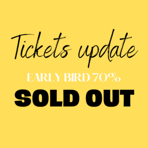
- White text on yellow background is unreadable
- No hierarchy, so the message gets lost – it might look as if the tickets are sold out
- 3 typefaces clash together and create visual clutter
OOF, BETTER
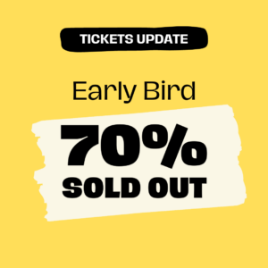
- Contrast is correct – all texts are readable
- Good hierarchy – text sizes make the message more clear, highlights help with focusing on the main message
- 1 typeface with the main message set in bold
Hierarchy helps a lot with structuring and delivering the message:
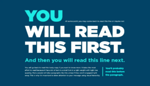 Source: Appleton
Step 3: Use our size cheat sheet for Canva
The best font sizes vary depending on the platform and the device being used to access it. Generally, the following font sizes are recommended:
Facebook post: 48pt for headlines and 24pt for body text
Twitter post: 88pt for headlines and 36pt for body text
Instagram story: 96pt for headlines and 48pt for body text
LinkedIn post: 88pt for headlines and 36pt for body text
Presentations: 48pt for headlines and 24pt for body text.
Print A4: font size 28-32pt for headlines and 10pt for body text.
Keep in mind that font size might look different on other devices, so don’t be afraid to tweak things and make sure it’s looking good for everyone. And don’t forget, using easy-to-read fonts is key for making sure your message gets across loud and clear.
Step 4: Test your design!
It’s always good to review your designs with other people, especially with your target audience. And remember, mistakes happen. But you can always learn from them and improve your next designs!
“People ignore design that ignores people”
– Frank Chimero
Ok, let’s wrap it up!
Here is a small recap: remember to think about your audience and how they’ll be interacting with your words. Make the font big enough to read and choose clear, easy-to-read fonts. And last, but not least, don’t be afraid to add some personality to your titles. Happy writing!
Hungry for more?
Check out these links. We found them super interesting!
Accesibility in type and typesetting / Eleni Beveratou
Open Captions in Social Media Videos: What’s the Best Font Size?
Typography in Inclusive Design Part 1: 8 key tips for accessible typography
Your ultimate guide to understanding typography
Illustrated glossary of typographic terms you should know
The effect of type design and typesetting on visually impaired readers
Best Practices to Improve Text Readability for Optimal User Experience
AccessAbility 2: A Practical Handbook on Accessible Graphic Design
Or drop us a message!
Instagram DM @josworld_coop

Yours truly, the Tea Time crew