Tea time: topic 1: Contrast
Geschreven door Laurent op 14 December 2022
We always start from the idea that if it works for a small group of people, it certainly works for the biggest one.
Each month we take a deep look at what a certain topic means for us, but also for the design/communication world.
This month it’s:

How do they affect designs/communication, how to make them for everybody. And how do I increase my impact!
Whether you want more sales or more connectivity from your audience.
Because great contrast =
+ Accessibility
+ Inclusivity
+ Sales


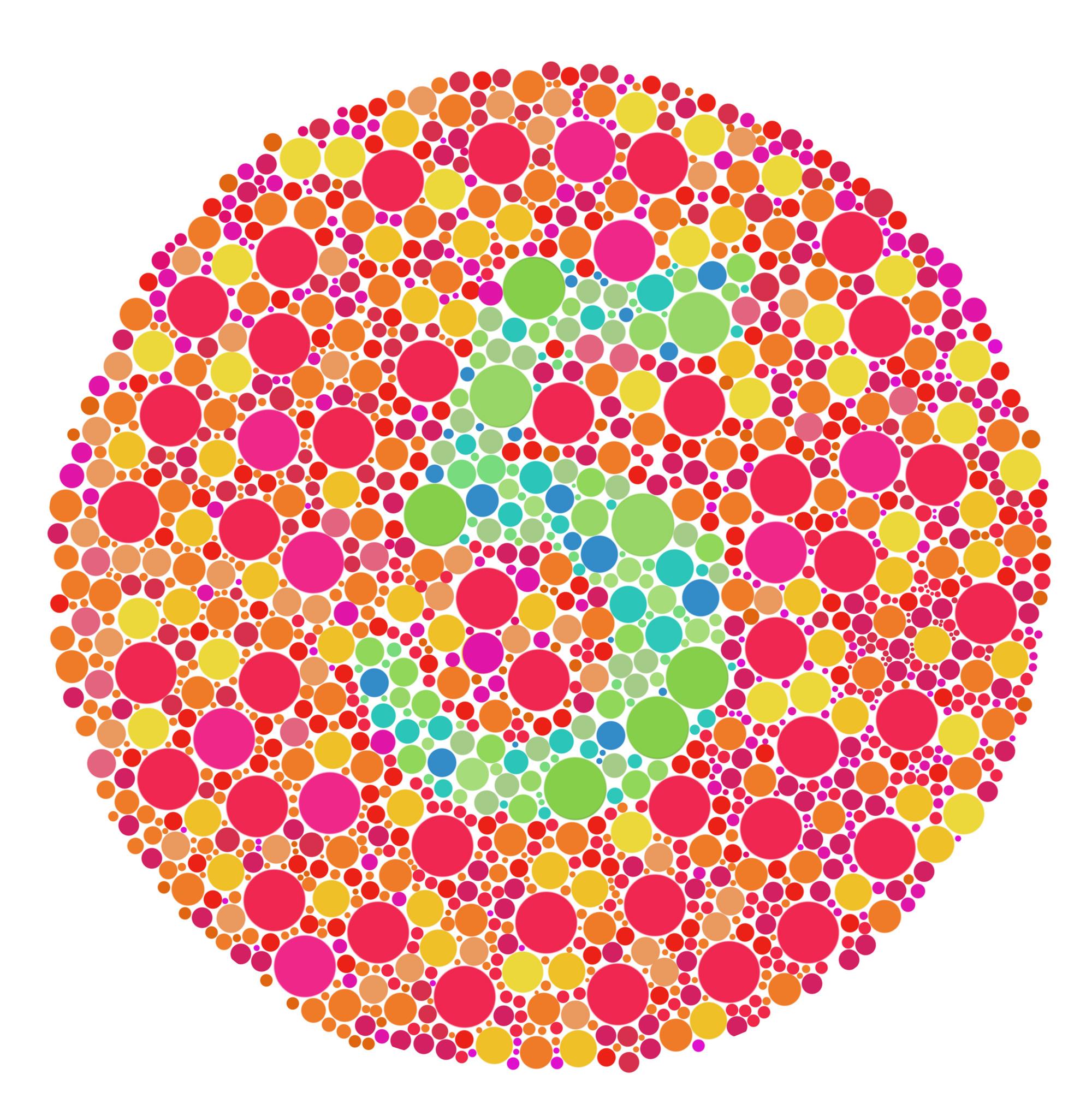
Colorblindness:
It’s a common problem that affects around
1 in 12 men and
1 in 200 women.
Bigger problem:
It is estimated that
1 in 10 people have dyslexia.
But wait jos? What does this have to do with contrast?
Dyslexia:
Avoid very high contrast.
Be aware also that for some people, especially people with dyslexia, will make reading more difficult.
Tips:
- Use single colour backgrounds. Avoid background patterns or pictures and distracting surrounds.
- Use sufficient contrast levels between background and text.
- Use dark coloured text on a light (not white) background.
- Avoid green and red/pink, as these colours are difficult for those who have colour vision deficiencies (colour blindness).
- Consider alternatives to white backgrounds for paper, computer and visual aids such as whiteboards. White can appear too dazzling. Use cream or a soft pastel colour. Some dyslexic people will have their own colour preference.
- When printing, use matt paper rather than gloss. Paper should be thick enough to prevent the other side showing through.
Olly Moss is a good example of a designer who plays around with contrast to narate and increase a visual story.


Luckily a bunch of great tools exist.
Such as
Colourblind : Adobe color accessibility
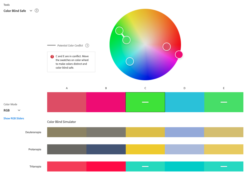
A great tool to test if your proposed colours are actually not a risk for users suffering from colourblindness.
It also corrects and redirects towards more favourable colours.
Contrast checker : Adobe contrast check
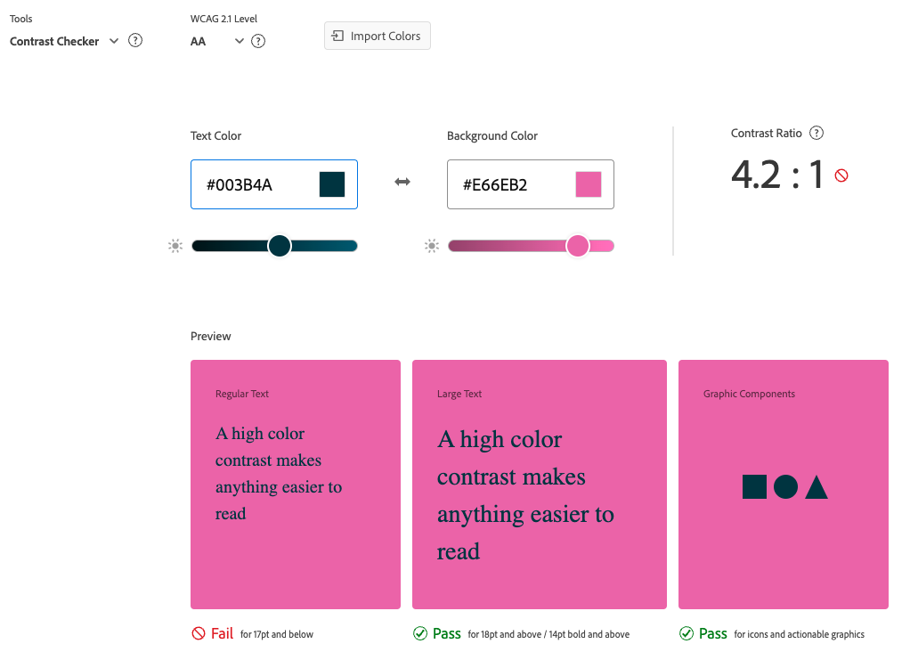
When the value reaches 4:5 and beyond it reaches the WCAG limit for approved contrast.
*What is the WCAG*
Web Content Accessibility Guidelines (WCAG) 2 is developed through the W3C process in cooperation with individuals and organizations around the world, with a goal of providing a single shared standard for web content accessibility that meets the needs of individuals, organizations, and governments internationally.
Multiple Levels of acceptance exist:
- level AA
- level AAA
But also Types:
- Regular Text
- Large Text
- Graphic Components

- Aim to reach at least a maximum of level AA for text.
- Stay away from too high contrast for text (dyslexia)

In this order
- Contrast & colors
- Typography
- Illustration/photography
- AI
- Web (UI/UX)
Thanks for reading, see you around!


